A neutral bathroom needs contrast in texture, depth and sheen even when its colours stay close. Start with one dominant undertone and a small material family.
Neutral does not mean colourless. Cream, sand, putty, mushroom, warm grey and pale timber all have undertones that determine whether a room feels cohesive.
Build from one anchor material
Start with the floor or main wall material, then choose the countertop and cabinetry to support it. Keep highly patterned surfaces to one main area so the room has somewhere for the eye to rest.
Use shadow as part of the palette
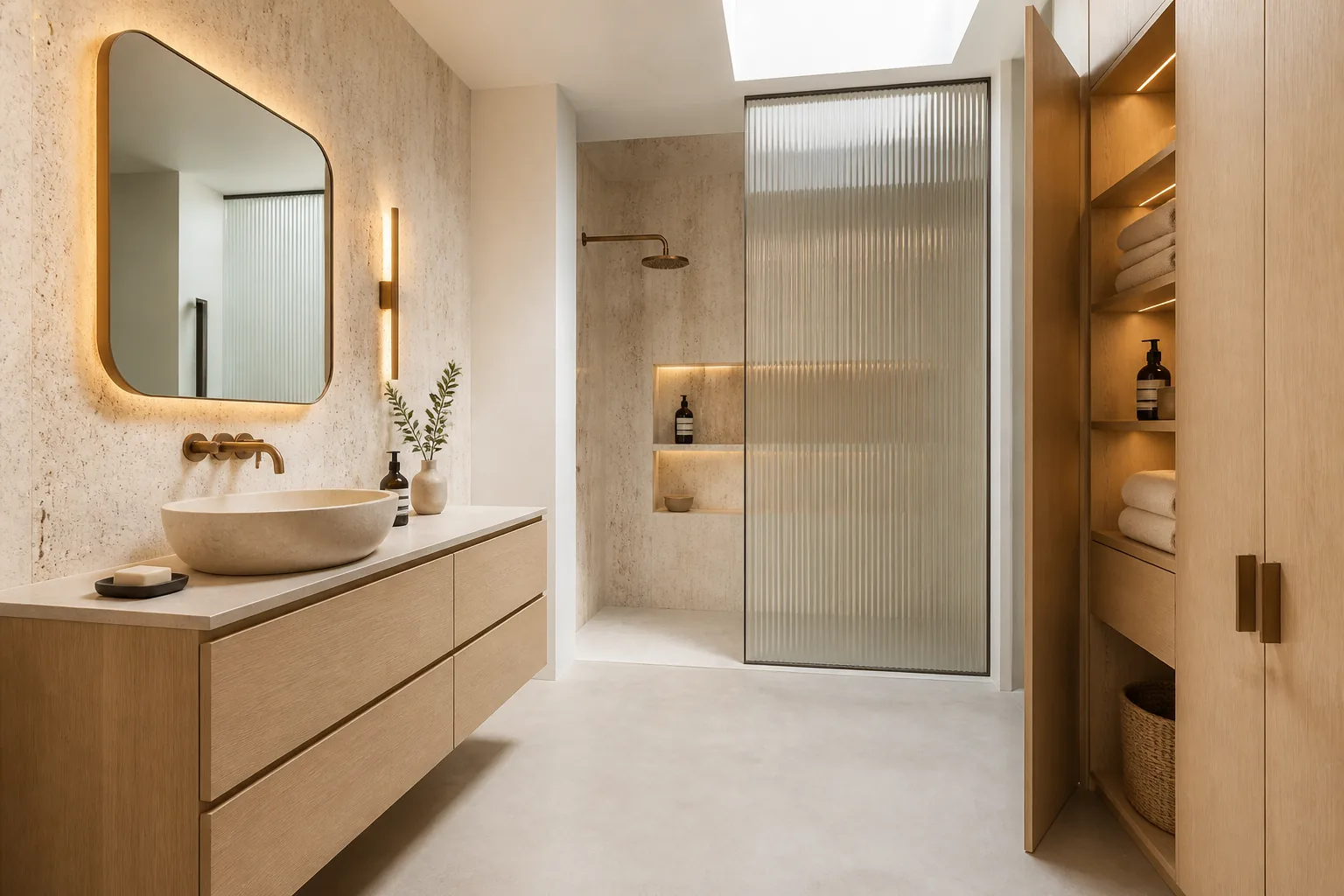
Recessed niches, fluted cabinet fronts, stone edges and soft cove lighting create depth. These details allow close colours to remain legible without strong contrast.
Keep ceramics and sealants in the sample set
White basins and toilets are not all the same white. Grout and silicone can also shift a warm palette cooler. Approve them with the main materials before repeating a scheme across units.
Plan for future matching
Record manufacturer references, finish codes and approved alternates. For hotel and apartment work, consider spare quantities for tiles and high-wear fittings so the neutral scheme remains consistent over time.
Coordinated selection
Products to resolve as one system
Coordinated sample board
Review tile, grout, vanity, countertop, ceramic and metal together under project lighting.
Visual references
See the decisions together
Questions answered
Planning FAQ
How do you stop a neutral bathroom looking boring?+
Vary texture, scale and sheen. Pair quiet field surfaces with one tactile cabinet, stone or glass feature rather than adding many colours.
Are neutral bathrooms suitable for hotels and apartments?+
Yes. A controlled neutral palette can be repeatable and broadly appealing, provided finishes are durable and replacement batches are managed.